NGINX Plus Release 6 (R6) introduces a great update to the live activity monitoring dashboard that gives you visibility into the real‑time performance of NGINX Plus. In this article, we’ll dissect the dashboard and look at some of the statistics behind it.
Editor –
- For an overview of all the new features in NGINX Plus R6, see Announcing NGINX Plus R6 with Enhanced Load Balancing, High Availability, and Monitoring Features on our blog.
- For detailed discussions of other new features in NGINX Plus R6, see these related blog posts:
The live activity monitoring dashboard in NGINX Plus displays a wealth of real‑time information:
- Key software information and high‑level alerts relating to the performance and operation of your load‑balanced cluster
- Real‑time and historical (average) performance data – requests and bandwidth – based on server zones and applications that you define, for the HTTP and TCP services that you configure
- Detailed performance and health information for each upstream load‑balanced group
- Instrumentation and diagnostics on the operation of each content caches
Like many modern applications, the NGINX Plus dashboard is a static web page (/var/www/html/status.html) that is driven and updated by a RESTful API. The API polls the Extended Status handler each second, retrieving a JSON object containing a large number of counters and gauges, and then charts them in a range of displays:
To see the dashboard in action, check out the demonstration at demo.nginx.com.
Getting Started with the Live Activity Monitoring Dashboard
Our recent post, Live Activity Monitoring of NGINX Plus in 3 Simple Steps, discusses a sample script that we provide to make it easy to configure the dashboard. For reference, the configuration is duplicated here:
server {
    listen 8080;
    root /usr/share/nginx/html;

    # Redirect requests for / to /status.html
    location = / {
        return 301 /status.html;
    }

    location = /status.html { }

    # Everything beginning /status (except for /status.html) is
    # processed by the status handler
    location /status {
        status;
    }
}
Because this configuration represents a standard NGINX virtual server, you can easily extend it to add access control rules, deliver the content over SSL/TLS, and change the IP address and port for the service.
The Components of the Dashboard
The dashboard provides several different types of information.
Global Traffic Counts
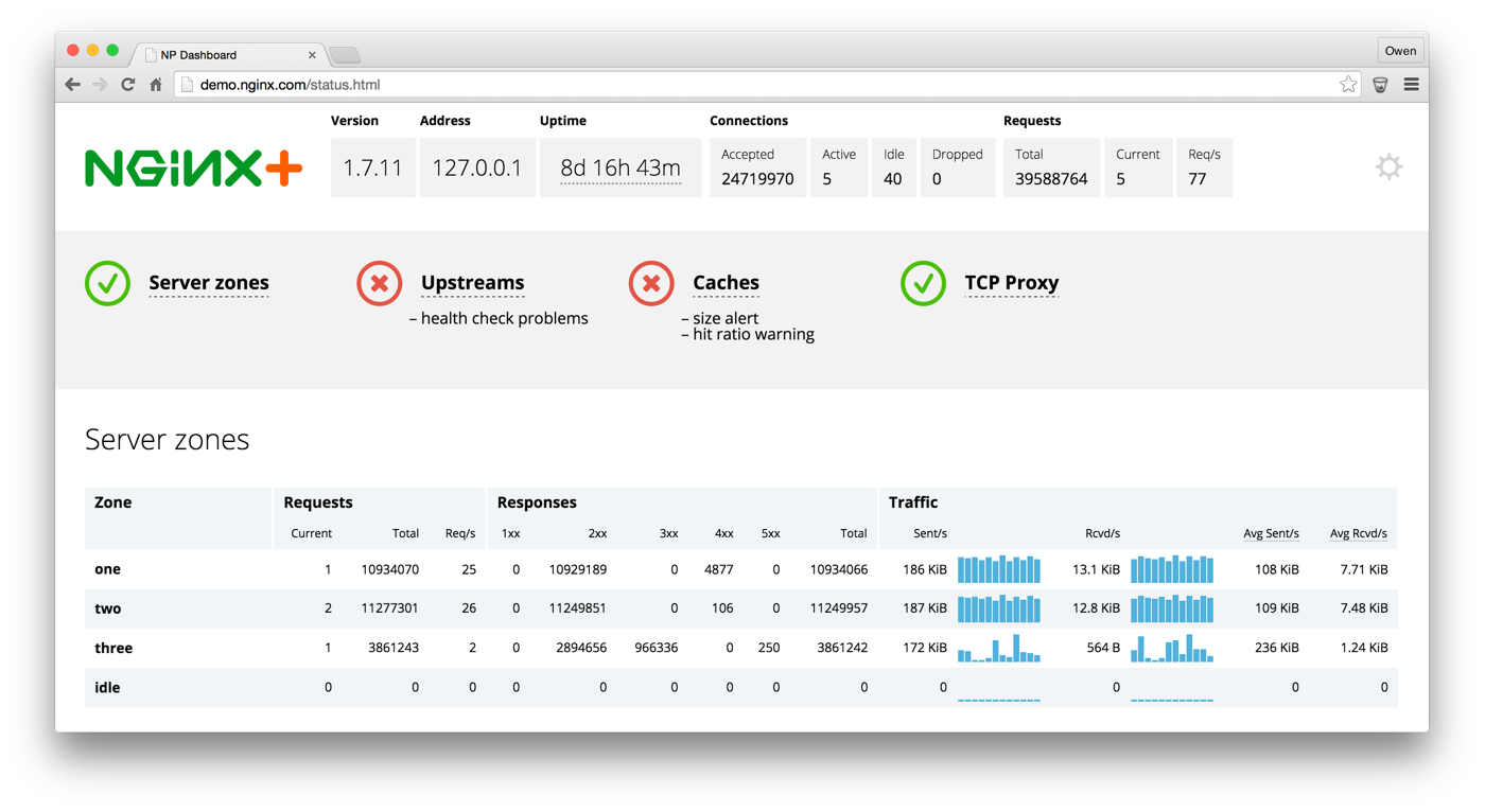
The top section of the dashboard summarizes status and traffic at a high level:

The Connections table lists the number of connections that NGINX Plus has received since startup or configuration reload. The Active and Idle fields report the instantaneous number of connections; it’s normal to see some active connections (meaning there’s a request in flight) and some idle (the client is holding the connection alive for an HTTP keepalive).
Similarly, the Requests table reports the number of HTTP requests NGINX Plus has handled since startup or configuration reload This count is commonly larger than the Connections count, because one connection can transport several requests. The Req/s (requests/second) field reports the single most useful measure of activity; even if NGINX Plus is idle, you’ll see this count increment once per second because the dashboard handler issues one request for the /status URL each second.
Service Status
The service status section gives you an immediate perspective on the health of your NGINX Plus deployment. Details about each element appear in tables further down on the dashboard.

The green check means all is okay, the red X indicates a problem you should look into, and the amber exclamation point warns you that things are not working optimally.
Server Zones
To view a wide range of statistics about a virtual server in the Server zones table, you need to make the server a member of a “status zone” by including the status_zone directive in its configuration block. You can configure more than one virtual server to belong in the same zone (for example, to combine statistics for HTTP and HTTPS servers), in which case the values for the zone are aggregated across all zone members.
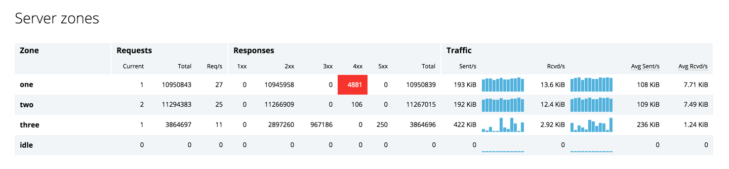
The line for zone one in the table above results from this configuration block:
server {
    status_zone one;
}
This is where the deeper analytics begin. When errors occur, the dashboard immediately flags them in red, as shown for the Responses – 4xx field in the table above, and then they fade away. The Traffic section in the table reports both current and average traffic levels so you can determine if current traffic volumes differ significantly from the norm.
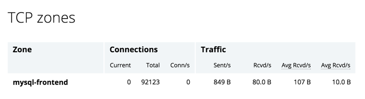
You can also configure TCP virtual servers into zones, and view connection rates and the amount of data transferred in the TCP zones table:
Upstreams
Many organizations use NGINX Plus as a load balancer and application delivery controller, and the tables in the Upstreams section of the dashboard monitor the health and performance of the nodes that NGINX Plus is load balancing traffic across.
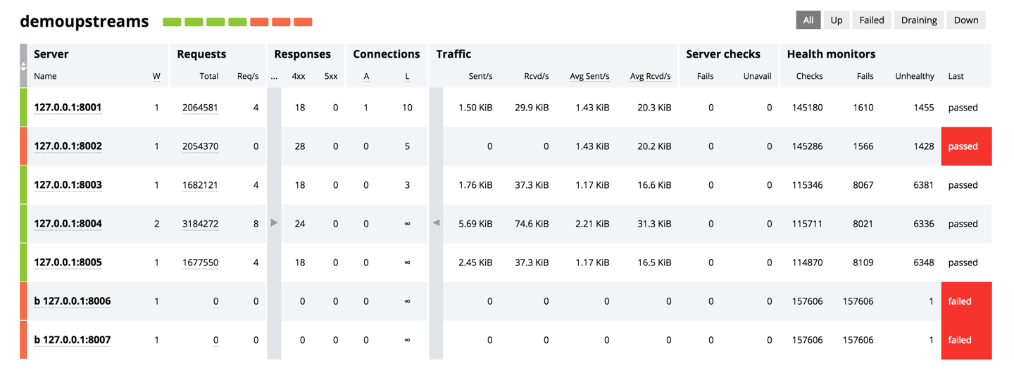
Each upstream group gets its own table in the Upstreams section (the table above is for the demoupstreams group). The fields under Requests, Responses, Connections, and Traffic enable you to drill down into the performance of each upstream server. The fields under Server checks and Health monitors measure the number of failures when sending requests to each upstream server or running health monitors against each upstream server, respectively.
The dashboard displays some of the most commonly used statistics, and there are many more in the full JSON data stream. For a list of all the statistics, see the documentation for status_zone directive, and you can get a flavor of how to drill down into the JSON data here (the data is for a single server in an upstream group in the demo called demo-backend).
Caches
Finally, the dashboard gives you insight into the performance of the disk‑based content caches that you configure in NGINX Plus, with one report for each defined cache zone:
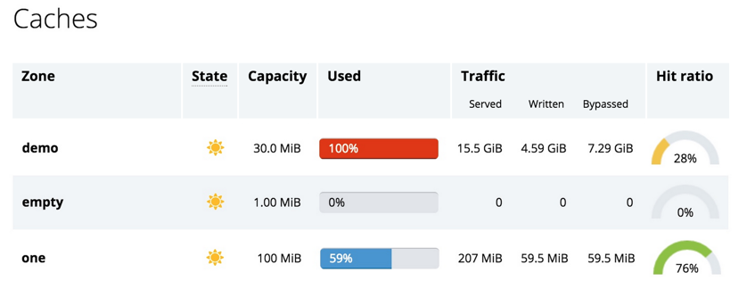
Caches begin in the Cold state (a snowflake icon), as the cache loader process initializes each cache from the files on disk. Once a cache is fully initialized, its state moves to Warm (a sunshine icon).
Caches grow continually until they reach 100% utilization. The cache manager process periodically scans the cache and prunes old (least recently used) entries to keep the size within the configured maximum limit.
The fields under Traffic and the Hit ratio meters report the effectiveness of the cache – requests served from the cache, requests that were stored in the cache (Written) and requests that bypassed the cache (because the cache content was missing or out of date, or because of user configuration). Hit ratio is a moving average over the past 5 minutes (by default).
Configuring the Dashboard
The settings icon in the dashboard allows you to fine‑tune how frequently the dashboard page pools NGINX Plus, and the thresholds for various responsive components of the display.
The JSON Activity Data
Behind the pretty face of the dashboard is a comprehensive JSON data feed.
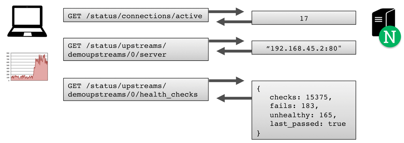
You can explore this data using your web browser – a JSON pretty‑printer extension such as JSONview (for Chrome or Firefox) helps immensely. URLs begin with /status, and you can drill down and see a subset of the data.
Many of the values operate like SNMP counters. For example, the requests counter (URL http://demo.nginx.com/status/requests/total) lists the total number of requests processed since startup or reconfiguration. To derive the number of requests per second, sample this counter twice, and divide the difference by the number of seconds between samples.
Using Third‑Party Monitoring Tools for NGINX Plus
A number of third‑party tools have developed integration packs for the NGINX Plus statistics data stream:
… and with the RESTful interface, it’s easy to add NGINX Plus monitoring to your own custom dashboards and tools, too!
Try out the live activity monitoring dashboard in your own environment – start your free 30‑day trial of NGINX Plus today or contact us for a live demo.
Editor –
- For an overview of all the new features in NGINX Plus R6, see Announcing NGINX Plus R6 with Enhanced Load Balancing, High Availability, and Monitoring Features on our blog.
- For detailed discussions of other new features in NGINX Plus R6, see these related blog posts: